Mobile-first responsive website: biking navigation
Safebike

Project
Mobile-first responsive website
Duration
5 weeks
Role
UX/UI designer, researcher
Tools
Figma, Material Design 3, Google Workspace
1-min Overview
The problem: Many digital maps guide cyclists, but often prioritize speed over safety, leading cyclists to riskier routes with mixed traffic. This deters hesitant cyclists, as unfamiliar roads and heavy traffic make cycling feel unsafe, discouraging its use as a mode of transportation.
How might we help cyclists bike in safer and less congested travel routes? 🚲
🔎 Research & Insights: Through interviews and competitive analysis, we found that most cyclists prefer calmer streets and protected bike lanes. Current mapping tools either lack safety features or fail to offer turn-by-turn navigation with safety as priority.
👩🏻💻 Design & Testing: We prioritized must-have features like bike lane labeling and safety-first route suggestions, and tested our designs rigorously. Usability testing confirmed that our bike lane representation and navigation instructions are clear and user-friendly.
Introducing Safebike:


Safety over speed
Safebike emphasizes safety over speed by leveraging comprehensive street path data to guide users towards protected bike lanes and quieter neighborhood streets whenever possible.
Route labeling
It provides detailed route breakdown, indicating the type of bike lanes for each segment of the journey, ensuring users are informed before they begin their ride.


Real-time guidance
Safebike offers real-time navigation similar to Google Maps, providing a familiar and intuitive experience while eliminating the need for users to memorize their routes.
Keep scrolling for detailed case study ⬇️
1. Research
Interviews
Competitor analysis
2. Roadmapping
Feature prioritization
User flow
3. Design & Testing
Mid-fi wireframes
First usability testing
UI kit
4. Handoff
Seocnd usability testing
Final iteration
1. Research
Interviews
I interviewed 5 people separately via Google Meet, each ~30 minutes.

Insight #1: When talking about biking safety, 4 out of 5 participants bring up other traffic on the road and bike lane infrastructures.
Insight #2: 3 out of 5 participants deliberately said that they prefer to bike on calmer streets.
Main takeaway: Both bikers and non-bikers see heavy traffic as a major issue and prefer biking on calmer streets and in protected bike lanes.
Competitor analysis
None of the map products on the market offer the package deal: labeling of bike lanes + safety-first suggested routes + turn-by-turn navigation
Google Maps

Main strength
Powerful turn-by-turn navigation; leader in mapping platforms
Main weakness
Only prioritizes distance, not allowing users to prioritize safety
Chicago Bike Routes

Main strength
Detailed labeling of streets from a biking perspective
Main weakness
Does not support turn-by-turn navigation; user would have to memorize the route
Mellow Bike Map
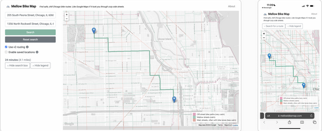
Main strength
Simple categorizations of streets from a biking perspective
Main weakness
Many inaccurate labeling of bike paths
2. Roadmapping
Feature set
Knowing that there are practical constraints to the project, I grouped my ideas into Must have's, Nice to have's, Surprising and delightful's, and Can come later's. For the rest of the project, I prioritized the Must have's for the MVP.
Must-have
-
Turn-by-turn navigation
-
Map for route-showing and navigation
-
Direction search bars
-
Suggested bike routes
-
Estimated time of traveling
-
Estimated time of arrival
-
Bike lane / path labels
Nice to have
-
Audio direction during turn-by-turn navigation
-
Auto completion for direction search
-
Route customization
-
Favorites
-
Live traffic information
Surprising and delightful
-
Bus and train stations
-
Bike parking racks
-
Avoid zones
-
Multi-destination routes
Can come later
-
Fast bike routes
-
Immersive view
-
Multilingual UI
User flow - user inputs destination and follows navigation
I created a user flow to see how every step fit together and make sure the they flowed seamlessly, considering unhappy paths and decision points.
3. Design & Testing
Mid-fi wireframes


A/B test
Option A
The labeling of bike paths are directly on the route, and users continue to see the labels during navigation.

Option B
The labeling of bike paths are pop up buttons that can be clicked on, and they go away as navigation starts.


First usability testing
The goals were to:
-
Determine if the current bike lane representation is clear to users
-
Choose a UI design that best represents bike lanes for users during navigation
-
Identify usability issues and make improvements based on user feedback
After conducting usability testing with 6 participants, I made the following iterations for my hi-fi wireframes:
#1:
I redesigned the representation of all types of bike lanes.
All 6 participants did not know what the brown/black line represented, signaling that it was a really unintuitive design. And, 3 out of 6 participants preferred a mix of both Option A and B.
I don’t know what black means. Does it mean that I’m not supposed to be there? Is that an alley? Is that an only-bike lane?


It doesn’t say which street name I’m turning left on... I feel like this is really important information as I'm anticipating a turn.
#2:
I added the street name of the street to be turned onto (i.e., "right turn onto XYZ street" instead of just "right turn").
3 participants voiced that, during turn-by-turn navigation, they would like to see the street name of the street they need to turn onto, not only the street they currently on.
#3:
I added voice navigation as a navigation option.
2 participants assumed that voice navigation would accompany the visual map because this is what they are used to.
Maybe the voice can tell you more information about the bike lanes so you don't have to rely on the screen. That’s what I do when I bike.

UI Kit
Adhering to Material Design 3 guidelines whenever possible, I created components that users are familiar with if they use Google Maps.
_edited.jpg)
4. Handoff
Second usability testing
After building hi-fi wireframes, I conducted another round of usability testing to:
-
Assess if the bike lane representation is clear to users
-
Evaluate if the navigation instructions are understandable
-
Identify usability issues and make improvements based on user feedback
1️⃣ First success metric: Each type of bike lane should be intuitively understood 80% of the time, before participants read the definition.
Test result
% of participants who understood the label
success metric
Success
Fail
Fail
Fail
100
80
40
10
"Protected lane"
"Unprotected lane"
"Shared lane"
"Residential lane"
2️⃣ Second success metric: 80% of participants should be able to discover the definition of each bike lane.
Result: 100% of participants discovered the definition of each bike lane by clicking on the correct button.
Success
3️⃣ Third success metric: 80% of participants should be able to accurately describe (therefore show understanding of) the navigation instructions.
Result: 100% of participants understood the navigation instructions.
Success
It's clear that my labeling of bike paths are still not intuitive for all. This means that I needed to come up with new naming conventions.
Final design iterations
Dropdown menu changed to buttons - users who are familiar with Google Maps would find it more intuitive to have buttons underneath the location input fields rather than a floating dropdown menu on the map.
Enlarged font size to improve accessibility - the font needs to be large enough for users to easily scan and read while on the bike.
Changed the text, icon, and color of bike lane signs - participants found the original terminology confusing, so alternate words are employed to improve understandability. The color and icon were changed to improve scannability.
Enlarged location icons - the blue and red location icons were enlarged to improve visibility.

.png)
Added distance information - while going down a street, bikers can now know the distance before the next turn, better preparing themselves during navigation.
Highlighted and enlarged the street name - the most important information for bikers during navigation is emphasized.
Select final screens


Key learnings
-
The importance of testing
Labeling bike lanes was the most challenging part of the project, so I really valued user feedback. I gained new, and sometimes unexpected, insights each time I did usability testing. I am sure that if I tested my final wireframes again, I would be able to improve my design even more.
-
Visual hierarchy
Especially on a mobile device, the screen size is quite small and it was challenging to fit information on a map in a cohesive and aesthetic way, all while being mindful of visual hierarchy. I needed to constantly put myself in the shoes of the user and imagine what they needed the most, then deciding which information to emphasize, and which information had a supporting role.
Next steps
-
Develop Safebike into a public website to serve the biking population
I had started working with a developer in the later phase of the project, with the goal to eventually make the website functional.
Check out my other case studies
.png)
Concept mobile app: Wonderland
.png)