Christ Community Church Website
.png)
Project
Church website
Role
Website designer, marketing
Tools
Wix, Unsplash, ChatGPT, PayPal, Google Ads
Deciding on a Style
Me
How would you use three words to describe Christ Community Church? I’m asking to figure out a ~vibe~ and primary colors for the website.
Very low key. No frills. Simple. Homey. Down to earth. Gospel. Welcoming. Friendly. Anyone can come and find community. No cliques.
Pastor Dave
I chose a warm tone for the church website to evoke a warm, welcoming feeling for visitors. Then, I designed a logo to represent the church's simplicity and Christ-centeredness.
Peach Sand
F4D6BB
Sunset Amber
EFB178
Terracotta
A56F5F
Coral Rose
DE9681
Plum Brown
402E32
Blush Pink
F4E5E1
Muted Taupe
CDC5C3
Soft Linen
FAF2F0
Structuring the Site
Home Page
Let's have a place where our church members can donate online.
I also added a mission statement, the church address, service time, and contact information because these are the most important information a visitor is looking for when visiting a church website.
"What We Believe" Page
I advocated for the addition of this page because it's important for visitors to see if their beliefs and doctrines align.
"What to Expect" Page
Let's have a What to Expect page to show visitors, well, what to expect at our church.
People want to conduct a "vibe check" when viewing a church's website. This page would be that "vibe" that they are checking.
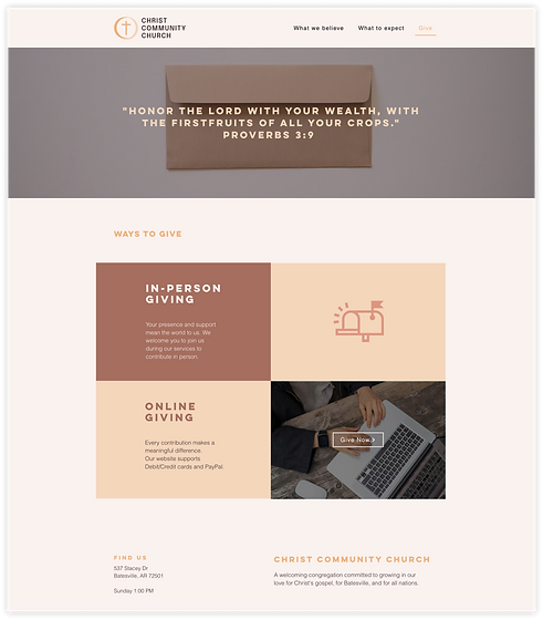
Donation Page
I chose PayPal for the donation site for its low transaction fees and ease of addition to the site. Most members at this church are not tech-savvy, so PayPal's super easy payment platform is perfect for this congregation.
The church being very new and still in the process of finalizing their staff, they prefer a minimalist site with only a few pages for now. Throughout the design process, I aligned with their goal to be "simple, modern, and no-frills."

.png)


Discoverability


I created the website on Wix without prior experience in SEO, Google Ads, or JSON-LD, but quickly learned on the spot with the help of ChatGPT. I developed a Google Ads plan and suggested specific actions to enhance SEO for the site. While internal changes of the church limited the implementation of my recommendations, the groundwork was laid for future growth.
Mobile Access


I optimized the design to ensure a consistent user experience across all devices by adjusting and simplifying elements where necessary.
Impact & Takeaway
-
By optimizing the church's website, weekly and monthly tithing from members became significantly more convenient and streamlined, enhancing overall user satisfaction.
-
Quickly adapted to new tools and concepts, leveraging ChatGPT to learn and implement solutions on the spot.
-
Gained insight into the strengths and limitations of Wix—great for simple projects but not ideal for more complex, feature-rich websites.

